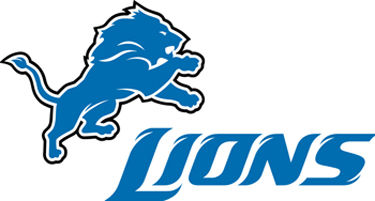
I’m not sure whether it’s a late April Fools’ Day joke, a desperate attempt to show that they aren’t a complete farce, or a typical 4/20 brainstorming session but the Detroit Lions have updated their logo. The new logo is the same leaping lion logo but it is supposed to look more fierce. Does anyone actually consider anything remotely related to the Lions “fierce”?

Also, the scripted Lions text logo has been tweaked to fit the new image. However, the 2009 Lions team is unlikely to be as fierce as the new logo and continue being a joke. On the plus side for the Lions, they will be able to make more money from selling new 0-16 jerseys.

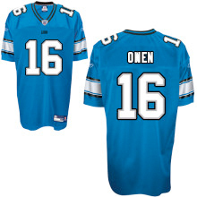
* Not actual 2009 jersey. NFLshop.com has decided that an “Owen 16” jersey isn’t appropriate.
